So here is what went into the paperback cover of Viking Fire...
I have to start off by getting something off my chest. When my publishers presented the hardback cover of Viking Fire they went for fairly uninspiring pagan imagery, compounded by the fact the wrap around back cover had a Viking man wearing a horned helmet. At reading after reading, keen-eyed readers and appalled reinactors, who take these kind of anachronisms very seriously came to chastise me and I had nothing to say in my defence. So this time round it was important that the book get the right cover.
 First thing to consider is that this is part of a series, so that the books should look like they're related. As Shieldwall, the first in the series, had a really strong cover, so it was settled fairly early that we went for something largely similar.
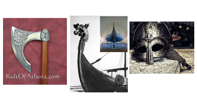
 The cover was being designed in-house at Little, Brown, so I put together a mood board of various strong 'Viking' images, with a mix of contemporary and modern images.
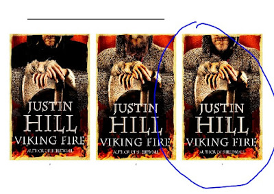
And then my publishers came back with the first set of rough ideas, one of which was this, which has a much later medieval feel, with great sword, mail coif and mailed sleeves; never mind the 1980s biker flames and a horrible font. But what it did give us a basic framework to move forward from.
I suggested changing the flames for a Byzantine skyline, to hint at how the book goes beyond typical Viking stereotypes, both geographically and in terms of characterisation. I also suggested that the cover image feature an axe, not only because this was a great way of getting Norse imagery into the cover, but also, according to his saga, Harald Hardrada went down fighting with a battle axe in hand. There was some tooing and froing with various types of armour possibly worn in the 11th century in the Mediterranean and the Scandinavian world, and finally my agent and I were very keen that the final image should look less 'photographic' than this, giving the book a more literary feel.
We soon settled on a number of variations on the basic idea and I was presented with a choice of images. My thinking, with these, was that the left hand one, with the hood, seemed too much like an executioner. The middle image the face appears a little malformed. So the right hand image it was, a face that many people have assumed is of me. Wouldn't that be something, to be on your own book cover!
Once that was settled, there was further discussion on the font and quotes, giving us the final 'face' of the book. But a cover has to work from the front, the spine, and also as a reader picks it up to browse it and see how interested they are.
There were quotes to blurbs to fix, and this terribly old author photo to remove. I also wanted to flag up that Viking Fire was picked by The Times, as one of their Books of the Year, 2016,
So here, at last, we settled on a final image, author photo, blurb and quotes.


